Checkout for 120 countries.
An accessible checkout, Amazon reviews and an About us page, all live.
2.3:1
White on brand blue · 9.3:1 with black text
- Checkout
- Reviews
- Shipped
I redesigned Book Depository’s checkout to meet accessibility standards, brought Amazon customer reviews onto its product pages, and took an About us page from blank to live.
- Role
- Designer, working with the UX lead
- Client
- Book Depository (an Amazon company)
- Timeline
- 2021–2023
- Team
- UX lead, developers, People & Culture team, marketing
- Tools
- Sketch, Illustrator, Photoshop, HTML
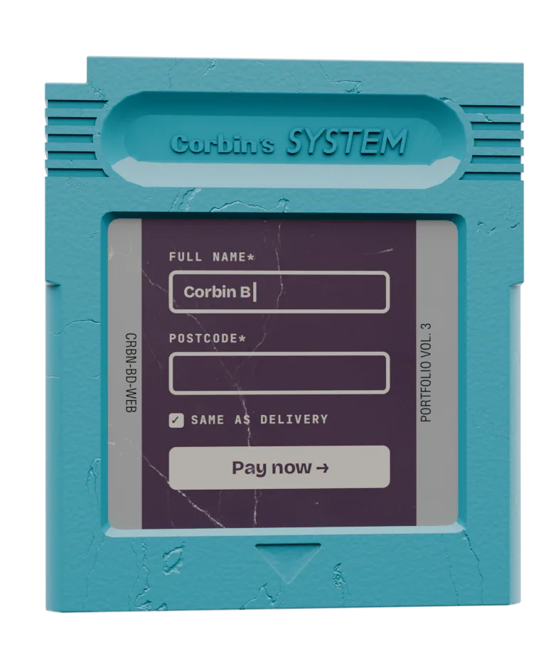
01Add a card
02Checkout, payment step
03Amazon reviews on a product page
01
Problem
Book Depository shipped books free to more than 120 countries, so its checkout had to work for every one of them. It didn’t work well for everyone. White text on the brand blue, used on buttons across the site including “Add to basket”, measured 2.3:1, well below the 4.5:1 WCAG asks for text. Input borders and secondary text were too pale as well. Field labels sat inside the inputs as placeholder text, which disappears once you start typing and isn’t reliably read out by screen readers.
The product pages had a different gap. The Tiger Who Came to Tea showed 15,717 ratings, all from Goodreads, but only two written reviews from Book Depository’s own customers. A shopper had a score to go on, and almost nothing in words.
02
Audience
The UX lead owned the work and set the standard. Before I touched the checkout, I completed the accessibility training she had written. Developers built from my wireframes.
The real audience was shoppers in 120+ countries: people using screen readers or keyboards, people with low vision, people entering addresses in formats our forms didn’t expect, and everyone who wanted to trust a review before buying.
03
Process
- Learn the standard first. I worked through the UX lead’s accessibility training before designing anything, then audited the existing checkout against it.
- Wireframe the whole flow. Address book, saved cards, add a card, contact details, payment and order confirmation: 12 screens per round, in Sketch.
- Iterate in rounds. Three dated rounds in May 2022 (16, 17 and 25 May), each reviewed with the UX lead before the next.
- Design the edge cases. Address lookup with a manual fallback, international address formats, VAT on the order summary, and error states for every required field.
- Reviews, November 2022. Nine product-page screens bringing Amazon customer reviews onto Book Depository: rating breakdown, filters, a photo gallery and a disclosure note. In December I refined it in XD as two layouts, reviews on the product page and a standalone page for every review with paging, working through four versions of the first and five of the second.
04
Decisions
- Decision
- Move every label outside its input, with an example underneath (“First and last name. For example: John Smith”).
- Trade-off
- Longer forms and more scrolling. In return the label never disappears while typing, and screen readers announce it every time.
- Decision
- Keep the brand blue, but wherever text sat on it, make the text black instead of white: 9.3:1 instead of 2.3:1, as on the “Selected card” banner. Around it, input and card borders went to #747474 (4.7:1), input text to #363636 (12.1:1), error text and borders to a darker red, #B60000 (7.0:1), and the tick box was redrawn with new sprites. For the Buy now button I put forward four colour options, each passing AA or better.
- Trade-off
- Black text on cyan looks heavier than the white the brand was known for. In return, the brand colour itself didn’t change at all, and every pairing could be checked against a number.
- Decision
- Address lookup first, with “Enter address manually” always one click away, given a drop shadow so it reads as a button rather than a link.
- Trade-off
- One more element on an already long form. In return, shoppers whose address the lookup couldn’t find, common across 120+ countries, were never stuck.
- Decision
- Tell shoppers where the reviews came from. A note above the reviews says they come via Amazon and may mention Amazon delivery, with a “Why are you displaying Amazon reviews?” link.
- Trade-off
- It admits the reviews aren’t Book Depository’s own. In return, a review complaining about Amazon delivery doesn’t confuse or worry a Book Depository customer.
- Decision
- Split reviews into “Top reviews from United Kingdom” and “Top reviews from other countries”.
- Trade-off
- The most-liked review isn’t always first. In return, shoppers read reviews written in their own context first (delivery, editions, language), which matters for a shop selling to 120+ countries.
05
Outcome
- The redesigned checkout and the Amazon reviews feature both went live on bookdepository.com.
- The checkout’s labels, helper text, error states and control colours were brought up to the UX lead’s accessibility standard.
- Also shipped: the About us page. Book Depository had no real About us page. The People & Culture team made the case for one; their customer survey found 83% of respondents rated a bookseller caring for its employees’ wellbeing as very or extremely important. My first design, in April, couldn’t be built within the limits of the site’s page builder, so I reworked it into a card layout that could: seven desktop and five mobile versions between April and July 2022. I then hand-coded it in HTML and CSS so it needed no developer time, and made its launch assets: email, social posts and site banners. Their proposal put it plainly: “The page was built by Corbin, and doesn’t need any support to put it live.”
- Book Depository closed in April 2023, so there are no long-term numbers to report.
06
Next
With what I know now, I’d measure from day one: checkout completion and form error rates before and after, and how often shoppers opened the reviews note. The accessibility work was right, but I couldn’t prove its effect, and proving it is what makes the next fix easier to get approved.
2.3:1
White on brand blue · 9.3:1 with black text
- Checkout, reviews and About us design
- Corbin
- UX lead and accessibility standard
- Book Depository UX lead
- Checkout and reviews build
- Book Depository developers
- About us proposal and customer survey
- Book Depository People & Culture team
- About us launch
- Book Depository marketing
- Context
- Book Depository, an Amazon company, closed in April 2023. Wireframes and designs shown with placeholder data.
Loaded: Checkout for 120 countries.
Drag the next cartridge into the reader, or press Enter on it · drag the seated one up to eject